第269章:Slot Recipes で複合コンポーネントを作る(Card, Dialog)🍱
この章は「パーツが複数あるUI(CardとかDialogとか)を、ひとつの“設計図”でまとめてスタイリングできるようになる」回だよ〜!😊🧁
1) Slot Recipe ってなに?🧩
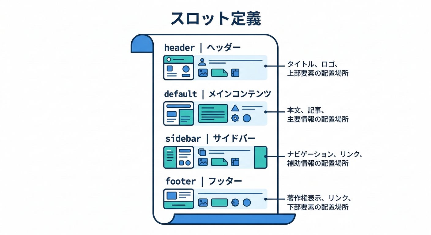
Slot Recipeは、1つのコンポーネントの中にある複数パーツ(= slots)を、まとめてスタイル定義する仕組みだよ🍱
slots / base / variants / defaultVariants / compoundVariants を持てるのが特徴! (panda-css.com)
さらに sva() は「Atomic版のSlot Recipe」を作るショートカット。 (panda-css.com)
しかも、Slot Recipeを作るとPandaが バリアント組み合わせのCSSを事前生成してくれる(速さに効く✨) (panda-css.com)
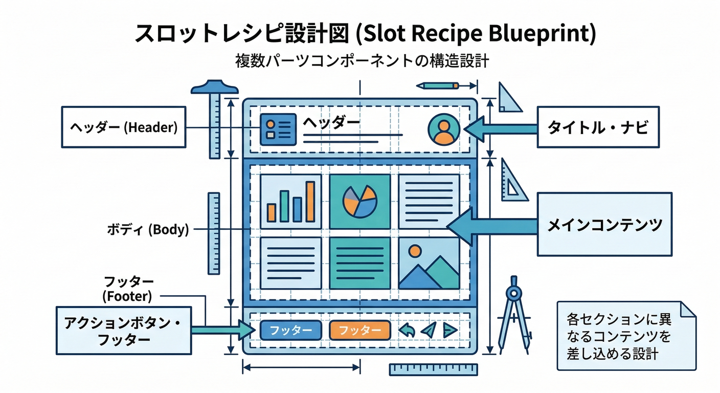
図:バリアント → 各slotのclassが一気に出る🪄
2) ハンズオン①:Card を Slot Recipe + Compound Pattern で作る🃏✨
2-1. Slot Recipe を定義する(Config Slot Recipe)🧾
プロジェクト直下に panda/slot-recipes/ を作って、ここに置く想定でいくね😊
panda/slot-recipes/card.ts
import { defineSlotRecipe } from '@pandacss/dev'
export const cardRecipe = defineSlotRecipe({
className: 'card',
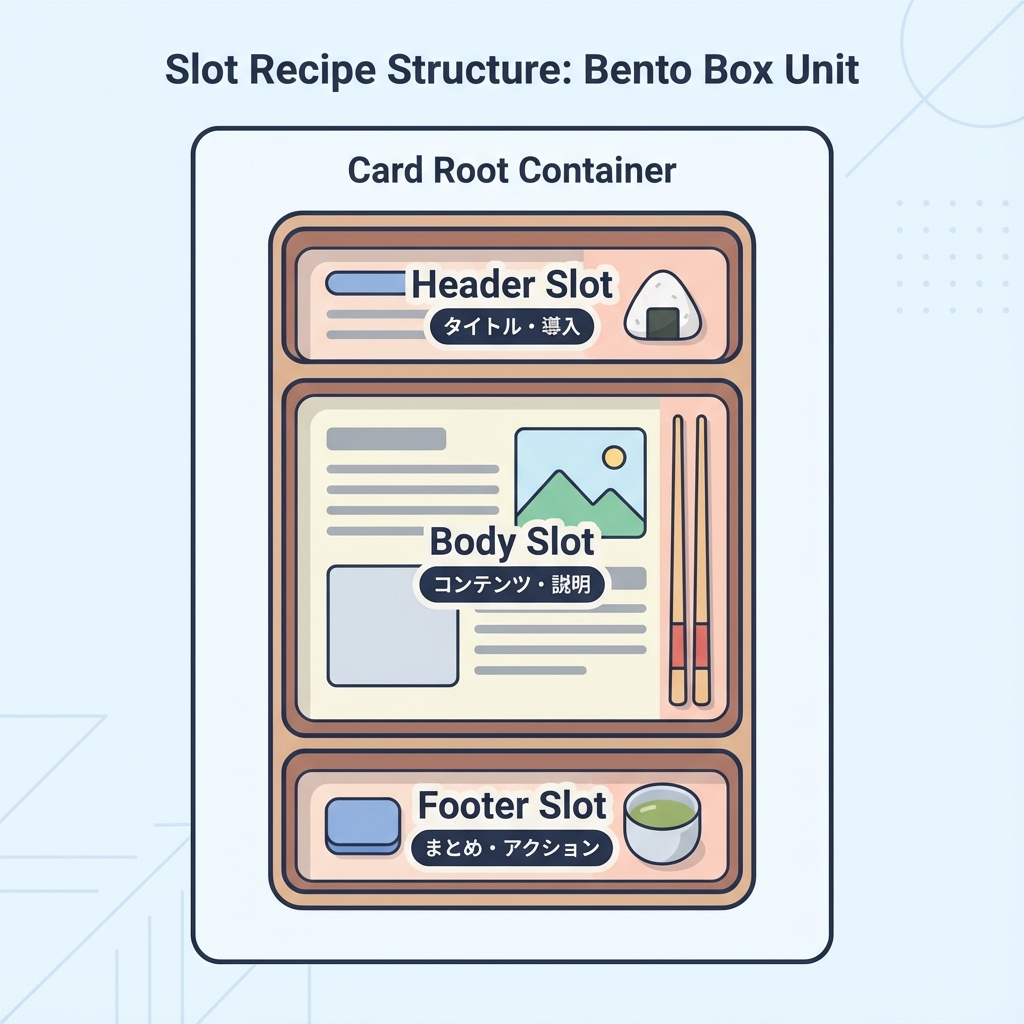
slots: ['root', 'header', 'body', 'footer', 'title', 'description'],
base: {
root: {
borderWidth: '1px',
borderColor: 'gray.200',
borderRadius: 'xl',
bg: 'white',
overflow: 'hidden',
},
header: { px: '4', pt: '4', pb: '2' },
body: { px: '4', pb: '4' },
footer: {
px: '4',
py: '3',
borderTopWidth: '1px',
borderColor: 'gray.100',
display: 'flex',
justifyContent: 'flex-end',
gap: '2',
},
title: { fontWeight: 'semibold', fontSize: 'lg' },
description: { color: 'gray.600', fontSize: 'sm', mt: '1' },
},
variants: {
variant: {
solid: { root: { boxShadow: 'sm' } },
outline: { root: { bg: 'transparent' } },
},
size: {
sm: {
header: { px: '3', pt: '3', pb: '2' },
body: { px: '3', pb: '3' },
footer: { px: '3', py: '2' },
title: { fontSize: 'md' },
},
md: {},
},
interactive: {
true: {
root: {
cursor: 'pointer',
transition: 'box-shadow 0.2s, transform 0.2s',
_hover: { boxShadow: 'md', transform: 'translateY(-1px)' },
_active: { transform: 'translateY(0)' },
},
},
},
},
defaultVariants: {
variant: 'solid',
size: 'md',
},
})
2-2. panda.config.ts に登録する🧩
Slot Recipeは theme.extend.slotRecipes に追加するよ〜! (panda-css.com)
panda.config.ts(差分イメージ)
import { defineConfig } from '@pandacss/dev'
import { cardRecipe } from './panda/slot-recipes/card'

export default defineConfig({
  // ...(既存の設定)
  jsxFramework: 'react',
  theme: {
    extend: {
      slotRecipes: {
        card: cardRecipe,
      },
    },
  },
})
2-3. codegen する(忘れやすい!)⚙️💦
Config Slot Recipe は、生成物が必要だから panda codegen を回すよ〜! (panda-css.com)
PowerShellで:
npx panda codegen
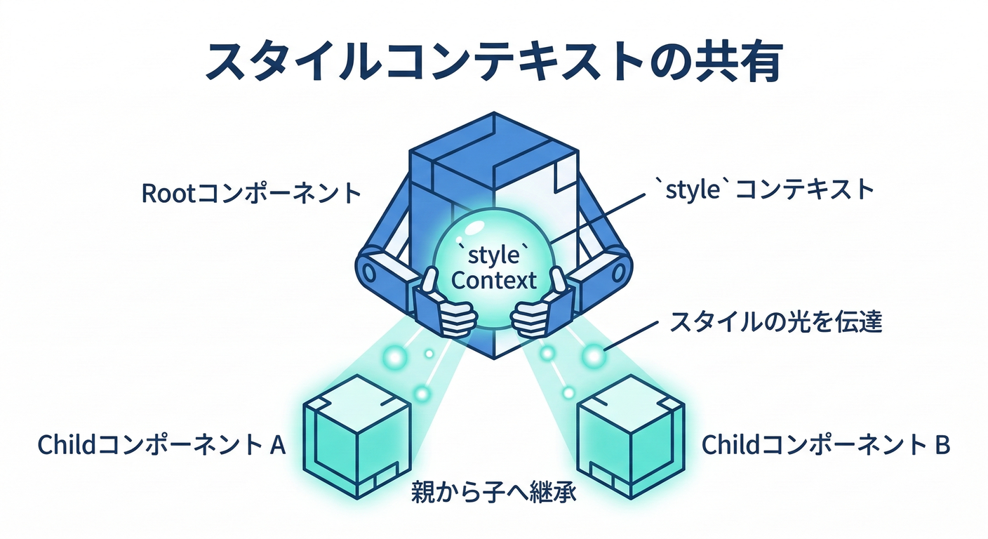
3) Card を “Compound Components” にする(ここが本番💎)
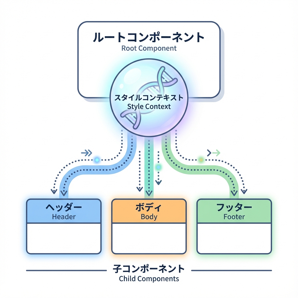
「Rootだけがvariantsを受け取って、子パーツは勝手に同じスタイル文脈を使う」感じにするよ✨
PandaのSlot Recipeページでも、createStyleContextでCompound Componentsを作る流れが紹介されてるよ〜! (panda-css.com)
図:Rootがスタイルを配り、子はそれを受け取る📦
3-1. Card コンポーネントを作る🧁
components/ui/card.tsx
'use client'

import { createStyleContext } from '@/styled-system/jsx'
import { card, type CardVariants } from '@/styled-system/recipes'

const { withProvider, withContext } = createStyleContext(card)

export type CardProps = CardVariants

export const Card = {
  Root: withProvider('section', 'root'),
  Header: withContext('header', 'header'),
  Body: withContext('div', 'body'),
  Footer: withContext('footer', 'footer'),
  Title: withContext('h3', 'title'),
  Description: withContext('p', 'description'),
}
※ createStyleContext を styled-system/jsx から使う形は、Panda系の実装例でもよく出てくるよ(Park UIの例とか) (Park UI)
3-2. 使ってみる(ページ)🎉
app/panda/card/page.tsx
import { css } from '@/styled-system/css'
import { Card } from '@/components/ui/card'

export default function Page() {
  return (
    <main className={css({ p: '6', display: 'grid', gap: '6' })}>
      <Card.Root variant="solid" size="md" interactive>
        <Card.Header>
          <Card.Title>Cardできた〜!🥳</Card.Title>
          <Card.Description>Rootだけでvariantsを管理できるよ✨</Card.Description>
        </Card.Header>

        <Card.Body>
          <ul className={css({ pl: '5', listStyle: 'disc', display: 'grid', gap: '1' })}>
            <li>slotごとにスタイル定義できる🍱</li>
            <li>Header/Body/Footerが勝手に揃う🪄</li>
          </ul>
        </Card.Body>

        <Card.Footer>
          <button
            className={css({
              px: '3',
              py: '2',
              borderRadius: 'md',
              bg: 'gray.900',
              color: 'white',
              _hover: { bg: 'gray.800' },
            })}
          >
            了解👍
          </button>
        </Card.Footer>
      </Card.Root>
    </main>
  )
}
4) ハンズオン②:Dialog(モーダル)も Slot Recipe で整える🪟✨
Dialogは「開閉・フォーカス管理・Escで閉じる」みたいなアクセシビリティが難しめ💦 なので ロジックはArk UIに任せて、見た目はPandaで作るのがめちゃ楽だよ😊 Ark UIは“unstyledでアクセシブルな部品”を提供してくれるやつ! (GitHub)
4-1. Ark UI を入れる📦
npm install @ark-ui/react
(Ark UI公式のインストール案内にあるよ) (GitHub)
5) Dialog の Slot Recipe を作る🧾✨
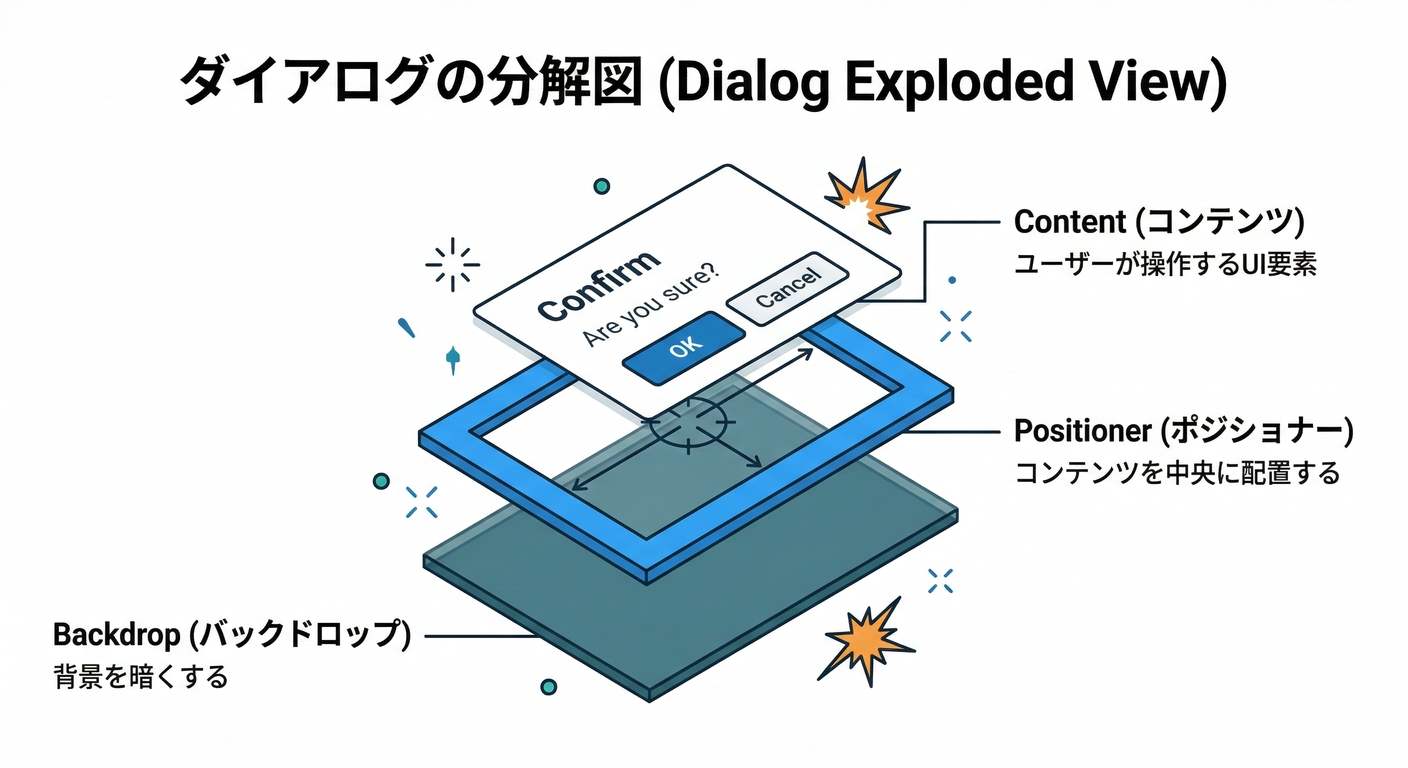
Park UIのDialog例だと、dialogAnatomy でslot一覧を作って、さらに header/body/footer を足してるよ(このやり方が超便利!) (Park UI)
panda/slot-recipes/dialog.ts
import { defineSlotRecipe } from '@pandacss/dev'
import { dialogAnatomy } from '@ark-ui/react/anatomy'

export const dialogRecipe = defineSlotRecipe({
  className: 'dialog',
  slots: dialogAnatomy.extendWith('header', 'body', 'footer').keys(),
  base: {
    backdrop: {
      background: 'black.a7',
      position: 'fixed',
      inset: 0,
    },
    positioner: {
      position: 'fixed',
      inset: 0,
      display: 'flex',
      alignItems: 'center',
      justifyContent: 'center',
      p: '6',
    },
    content: {
      bg: 'white',
      borderRadius: 'xl',
      boxShadow: 'xl',
      width: '100%',
      maxW: 'md',
      position: 'relative',
      overflow: 'hidden',
    },
    header: { px: '5', pt: '5', pb: '3', display: 'grid', gap: '1' },
    body: { px: '5', pb: '5' },
    footer: {
      px: '5',
      py: '4',
      borderTopWidth: '1px',
      borderColor: 'gray.100',
      display: 'flex',
      justifyContent: 'flex-end',
      gap: '2',
    },
    title: { fontWeight: 'semibold', fontSize: 'lg' },
    description: { color: 'gray.600', fontSize: 'sm' },
    closeTrigger: {
      position: 'absolute',
      top: '3',
      insetEnd: '3',
      borderRadius: 'md',
      px: '2',
      py: '1',
      _hover: { bg: 'gray.100' },
    },
    trigger: {
      borderRadius: 'md',
      px: '3',
      py: '2',
      bg: 'gray.900',
      color: 'white',
      _hover: { bg: 'gray.800' },
    },
  },
  variants: {
    size: {
      sm: { content: { maxW: 'sm' } },
      md: { content: { maxW: 'md' } },
      lg: { content: { maxW: 'lg' } },
    },
    placement: {
      center: { positioner: { alignItems: 'center' } },
      top: { positioner: { alignItems: 'flex-start', pt: '12' } },
    },
  },
  defaultVariants: {
    size: 'md',
    placement: 'center',
  },
})
panda.config.ts に追加(Cardと同じ要領):
import { dialogRecipe } from './panda/slot-recipes/dialog'

export default defineConfig({
  // ...
  theme: {
    extend: {
      slotRecipes: {
        card: cardRecipe,
        dialog: dialogRecipe,
      },
    },
  },
})
そして:
npx panda codegen
6) Dialog コンポーネントを作る(Ark UI × createStyleContext)🪄

Park UIのDialog例みたいに、createStyleContext(dialog) から withRootProvider / withContext を作ってつなぐよ! (Park UI)
components/ui/dialog.tsx
'use client'

import { Dialog as ArkDialog } from '@ark-ui/react/dialog'
import { Portal } from '@ark-ui/react/portal'
import { ark } from '@ark-ui/react/factory'
import { createStyleContext } from '@/styled-system/jsx'
import { dialog } from '@/styled-system/recipes'

const { withRootProvider, withContext } = createStyleContext(dialog)

export const Dialog = {
  Root: withRootProvider(ArkDialog.Root, {
    defaultProps: { unmountOnExit: true, lazyMount: true },
  }),
  Trigger: withContext(ArkDialog.Trigger, 'trigger'),
  Backdrop: withContext(ArkDialog.Backdrop, 'backdrop'),
  Positioner: withContext(ArkDialog.Positioner, 'positioner'),
  Content: withContext(ArkDialog.Content, 'content'),
  Title: withContext(ArkDialog.Title, 'title'),
  Description: withContext(ArkDialog.Description, 'description'),
  CloseTrigger: withContext(ArkDialog.CloseTrigger, 'closeTrigger'),

  Header: withContext(ark.div, 'header'),
  Body: withContext(ark.div, 'body'),
  Footer: withContext(ark.div, 'footer'),

  Portal,
}
7) Dialog を使ってみる(デモ)🎬✨
app/panda/dialog/DialogDemo.tsx
'use client'
import { Dialog } from '@/components/ui/dialog'
export function DialogDemo() {
return (
<Dialog.Root size="md" placement="center">
<Dialog.Trigger>開くよ〜🪟</Dialog.Trigger>
<Dialog.Portal>
<Dialog.Backdrop />
<Dialog.Positioner>
<Dialog.Content>
<Dialog.Header>
<Dialog.Title>確認だよ🫶</Dialog.Title>
<Dialog.Description>Slot Recipeで見た目が揃うよ✨</Dialog.Description>
</Dialog.Header>
<Dialog.Body>
<p>ここに説明文やフォームが入るイメージだよ😊</p>
</Dialog.Body>
<Dialog.Footer>
<Dialog.CloseTrigger>閉じる🙆♀️</Dialog.CloseTrigger>
</Dialog.Footer>
</Dialog.Content>
</Dialog.Positioner>
</Dialog.Portal>
</Dialog.Root>
)
}
app/panda/dialog/page.tsx
import { css } from '@/styled-system/css'
import { DialogDemo } from './DialogDemo'

export default function Page() {
  return <main className={css({ p: '6' })}><DialogDemo /></main>
}
Ark UIのDialogはこういう構造(Root/Trigger/Backdrop/Positioner/Content…)で組むよ、ってGitHubの例にもあるよ〜! (GitHub)
8) よくあるハマりどころ🧯😵💫
npx panda codegen忘れた →styled-system/recipesにcard/dialogが出てこない💦 (panda-css.com)- slot名のタイポ → そのパーツだけスタイル当たらない😵💫
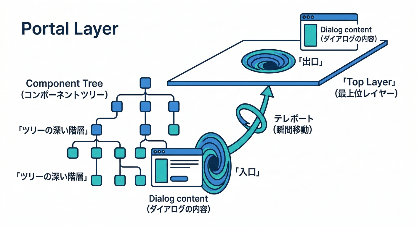
- Dialogが後ろに隠れる →
Portalを使ってレイヤーを分離すると安心🙆♀️(Park UI例でもPortal構成が出てくるよ) (Park UI)
9) ミニ課題🎓✨(5〜10分)
- Cardに
tone: "normal" | "accent"を追加して、accentだけ枠色を変えてみよ〜🎨 - Dialogに
size="sm" / "lg"を渡して、幅が変わるのを確認してみよ〜📐
次の章(第270章)は **Patterns(Stack/Grid)でレイアウトを“組み立てやすくする”**回だよ〜!📐✨