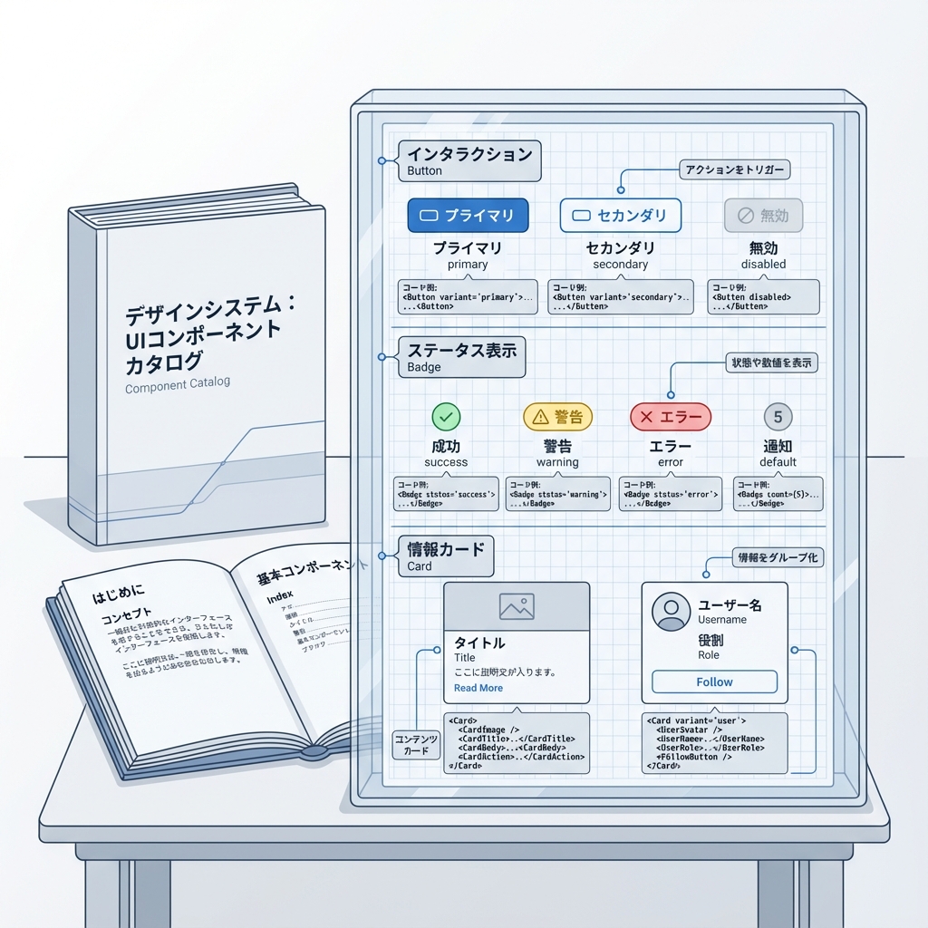
第274章:ミニ課題:Panda CSS でコンポーネントカタログを作る📖
今日は「自分だけの小さなUI図鑑」を作るよ〜!🥳
ボタン・バッジ・カードを Panda CSS の Recipes / Slot Recipes / Tokens で作って、/catalog に並べます📚✨
ゴール🎯(できたら勝ち!)
/catalogに Button / Badge / Card の見本が並ぶ👀✨- **バリアント(色/サイズ)**を切り替えて見れる🎛️
- ライト/ダークを切り替える(Tokenで色が変わる)🌞🌙
全体のつながり(ここが理解できると強い💪)
0) 下準備チェック✅(Pandaが動く状態?)
✅ package.json に prepare がある?
Panda公式の推奨は、依存インストール後に panda codegen を走らせる形だよ🧸
(styled-system を毎回生成してくれるやつ) (panda-css.com)
{
  "scripts": {
    "prepare": "panda codegen",
    "dev": "next dev"
  }
}
✅ 入口CSSにレイヤー宣言ある?
Pandaのレイヤー順を固定するやつ! (panda-css.com)
app/globals.css(または src/app/globals.css)に👇
@layer reset, base, tokens, recipes, utilities;
1) Next.js + PostCSSの注意(超大事⚠️)
PandaはPostCSSプラグインで入れるのが推奨だよ🐼 (panda-css.com)
ただし Next.js は postcss.config.* を置くと デフォルトのPostCSS設定が無効化されるので、必要なプラグインは自分で入れる必要があるよ⚠️ (Next.js)
postcss.config.cjs(おすすめ例)
(Panda + Next.jsのデフォルト相当を一緒に入れる)
module.exports = {
  plugins: {
    // Panda(公式例)
    "@pandacss/dev/postcss": {}, // :contentReference[oaicite:4]{index=4}

    // Next.js デフォルト相当(Next公式が例示してる構成)
    "postcss-flexbugs-fixes": {},
    "postcss-preset-env": {
      autoprefixer: { flexbox: "no-2009" },
      stage: 3,
      features: { "custom-properties": false },
    },
  },
};
もし
postcss-flexbugs-fixes/postcss-preset-envが入ってなければ、Next公式の警告どおり自分でinstallしてね🧷 (Next.js)
2) テーマ(ライト/ダーク)を Token で作る🌞🌙
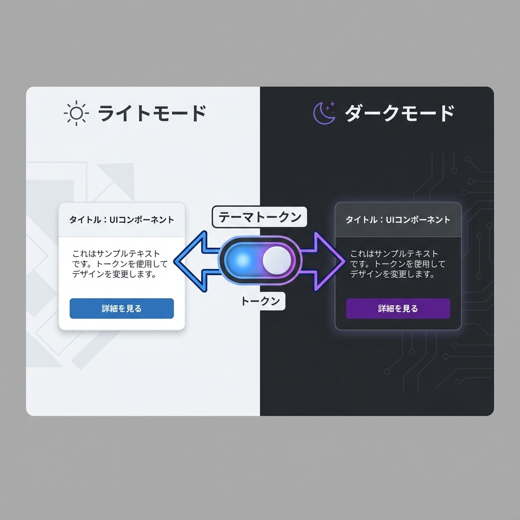
Pandaの Semantic Tokens は {colors.xxx} みたいに参照できて、さらに base / _dark で切り替えもできるよ✨ (panda-css.com)
ライト/ダークの判定は、data-color-mode を使うのがわかりやすい! (panda-css.com)
panda.config.ts(テーマ部分だけ例)
※ include のパスは自分の構成(src/ ありなし)に合わせてOK!
import { defineConfig } from "@pandacss/dev";

import { buttonRecipe } from "./styles/recipes/button.recipe";
import { badgeRecipe } from "./styles/recipes/badge.recipe";
import { cardRecipe } from "./styles/recipes/card.slot-recipe";

export default defineConfig({
  preflight: true,
  jsxFramework: "react",
  include: ["./app/**/*.{ts,tsx}", "./components/**/*.{ts,tsx}", "./src/**/*.{ts,tsx}"],
  exclude: [],
  outdir: "styled-system",

  // data-color-mode で light/dark を切り替える(公式ガイドの形) :contentReference[oaicite:8]{index=8}
  conditions: {
    light: "[data-color-mode=light] &",
    dark: "[data-color-mode=dark] &",
  },

  theme: {
    extend: {
      semanticTokens: {
        colors: {
          bg: { value: { base: "{colors.white}", _dark: "{colors.gray.900}" } },
          fg: { value: { base: "{colors.gray.900}", _dark: "{colors.gray.100}" } },
          muted: { value: { base: "{colors.gray.50}", _dark: "{colors.gray.800}" } },
          border: { value: { base: "{colors.gray.200}", _dark: "{colors.gray.700}" } },

          brand: { value: { base: "{colors.blue.600}", _dark: "{colors.blue.400}" } },
          brandFg: { value: { base: "{colors.white}", _dark: "{colors.gray.900}" } },
        },
      },

      recipes: {
        button: buttonRecipe, // defineRecipe を recipes に追加する流れ :contentReference[oaicite:9]{index=9}
        badge: badgeRecipe,
      },
      slotRecipes: {
        card: cardRecipe,
      },
    },
  },
});
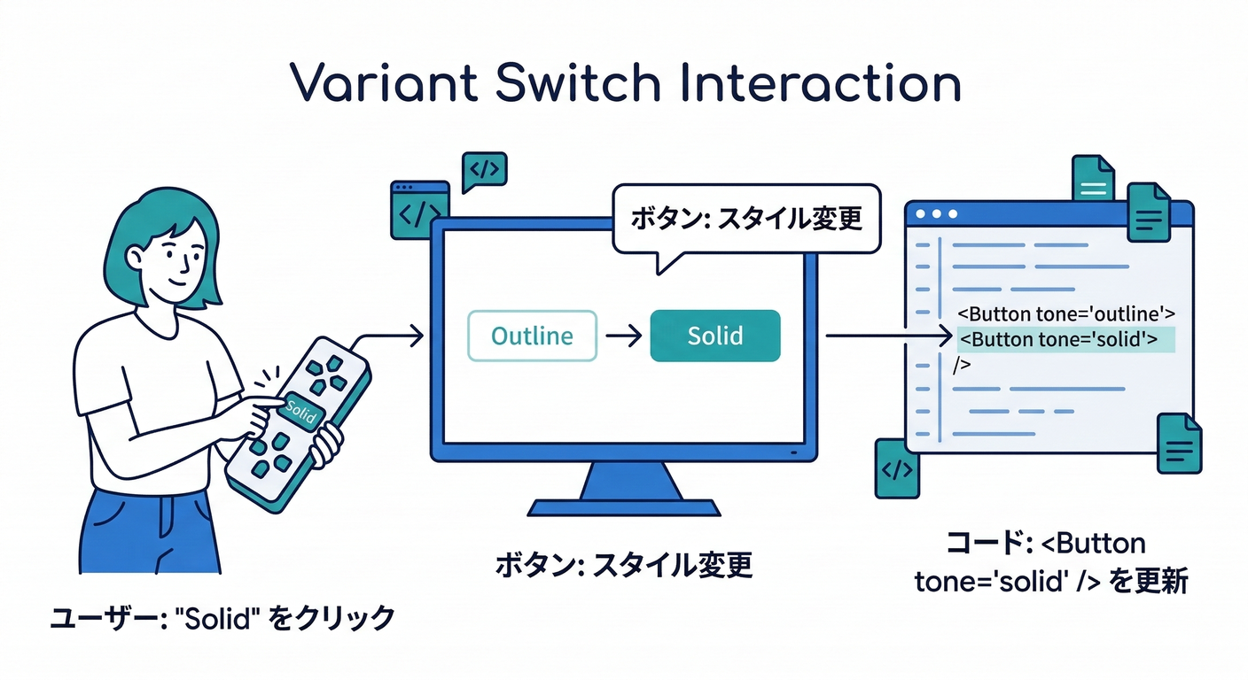
3) Recipes を作る(Button / Badge)🧂✨
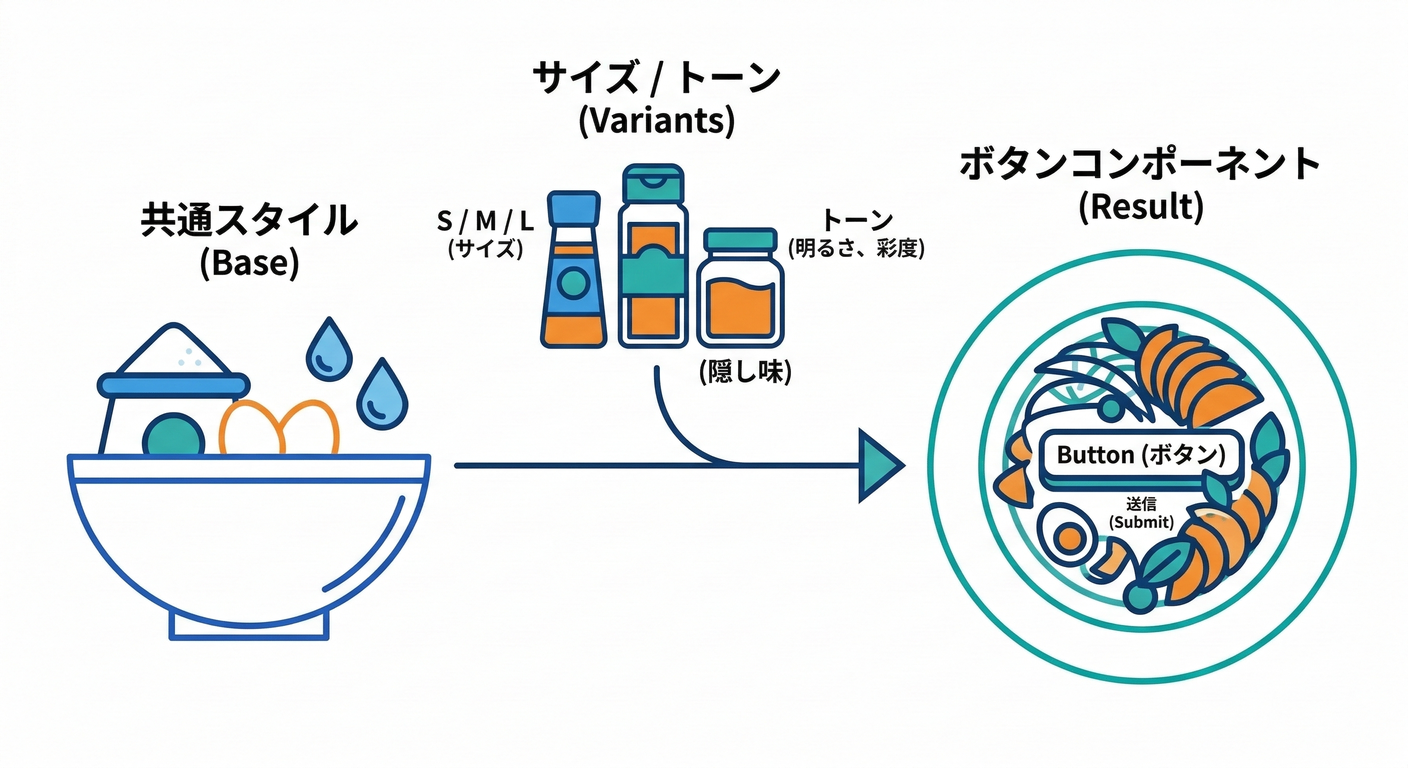
Pandaの Config Recipe は defineRecipe で作って、theme.recipes に登録するよ! (panda-css.com)
状態(hoverとか)は _hover が使えるよ〜🫶 (panda-css.com)
styles/recipes/button.recipe.ts
import { defineRecipe } from "@pandacss/dev";

export const buttonRecipe = defineRecipe({
  className: "btn",
  description: "Button styles",

  base: {
    display: "inline-flex",
    alignItems: "center",
    justifyContent: "center",
    gap: "2",
    fontWeight: "600",
    borderRadius: "md",
    borderWidth: "1px",
    transitionProperty: "background, border-color, color, transform",
    transitionDuration: "150ms",
    _active: { transform: "translateY(1px)" }, // :contentReference[oaicite:12]{index=12}
    _disabled: { opacity: "0.5", cursor: "not-allowed" }, // :contentReference[oaicite:13]{index=13}
  },

  variants: {
    tone: {
      solid: {
        bg: "brand",
        color: "brandFg",
        borderColor: "brand",
        _hover: { bg: "{colors.blue.700}" }, // :contentReference[oaicite:14]{index=14}
      },
      outline: {
        bg: "transparent",
        color: "brand",
        borderColor: "brand",
        _hover: { bg: "muted" },
      },
      ghost: {
        bg: "transparent",
        color: "fg",
        borderColor: "transparent",
        _hover: { bg: "muted" },
      },
    },

    size: {
      sm: { px: "3", py: "2", fontSize: "sm" },
      md: { px: "4", py: "2.5", fontSize: "md" },
      lg: { px: "5", py: "3", fontSize: "lg" },
    },
  },

  defaultVariants: {
    tone: "solid",
    size: "md",
  },
});
styles/recipes/badge.recipe.ts
import { defineRecipe } from "@pandacss/dev";

export const badgeRecipe = defineRecipe({
  className: "badge",
  description: "Badge styles",
  base: {
    display: "inline-flex",
    alignItems: "center",
    borderRadius: "full",
    fontWeight: "600",
    borderWidth: "1px",
  },
  variants: {
    tone: {
      brand: { bg: "brand", color: "brandFg", borderColor: "brand" },
      neutral: { bg: "muted", color: "fg", borderColor: "border" },
      outline: { bg: "transparent", color: "fg", borderColor: "border" },
    },
    size: {
      sm: { px: "2", py: "0.5", fontSize: "xs" },
      md: { px: "2.5", py: "1", fontSize: "sm" },
    },
  },
  defaultVariants: { tone: "neutral", size: "md" },
});
4) Slot Recipe で Card を作る🍱✨(複数パーツに最強)
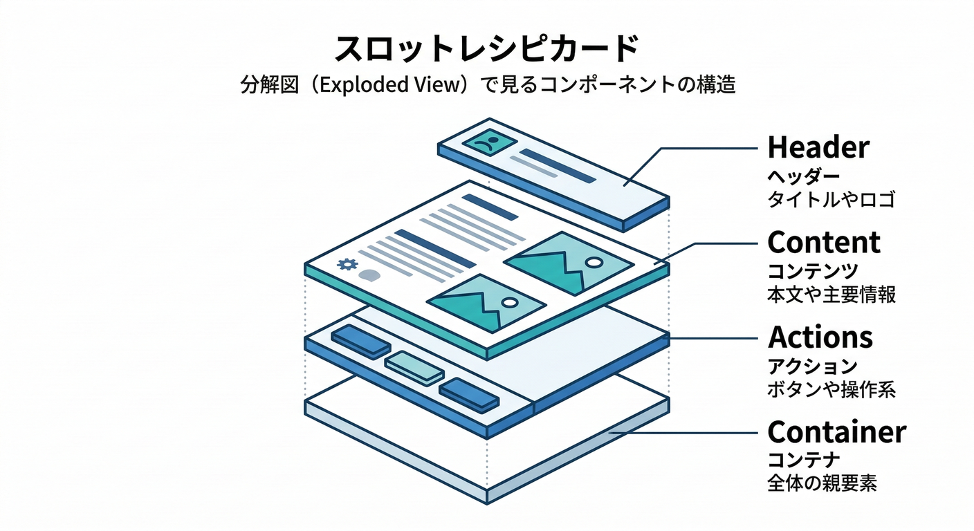
Slot Recipe は「root/header/body/footer…」みたいな 複数パーツをまとめてスタイリングできる仕組みだよ📦 (panda-css.com)
styles/recipes/card.slot-recipe.ts
import { defineSlotRecipe } from "@pandacss/dev";

export const cardRecipe = defineSlotRecipe({
  className: "card",
  slots: ["root", "title", "desc", "body", "footer"],

  base: {
    root: {
      borderWidth: "1px",
      borderColor: "border",
      borderRadius: "lg",
      bg: "bg",
      color: "fg",
      overflow: "hidden",
    },
    title: { fontWeight: "700", fontSize: "lg" },
    desc: { color: "{colors.gray.500}", _dark: { color: "{colors.gray.400}" } },
    body: { p: "4" },
    footer: { p: "4", pt: "0", display: "flex", gap: "2", justifyContent: "flex-end" },
  },

  variants: {
    variant: {
      flat: {
        root: { boxShadow: "none" },
      },
      elevated: {
        root: { boxShadow: "sm" },
      },
    },
  },

  defaultVariants: { variant: "elevated" },
});
5) UIコンポーネント化(Button / Badge / Card)🧩✨
styled-systemの場所がprojectRoot/styled-systemなら、相対importは自分の階層に合わせて調整してね🙏 (src/ありだと../../styled-system/...になりがち)
components/ui/Button.tsx
import * as React from "react";
import { cx } from "../../styled-system/css";
import { button } from "../../styled-system/recipes";

type Props = React.ComponentPropsWithoutRef<"button"> & {
  tone?: "solid" | "outline" | "ghost";
  size?: "sm" | "md" | "lg";
};

export function Button({ tone, size, className, ...props }: Props) {
  return <button className={cx(button({ tone, size }), className)} {...props} />;
}
components/ui/Badge.tsx
import * as React from "react";
import { cx } from "../../styled-system/css";
import { badge } from "../../styled-system/recipes";

type Props = React.ComponentPropsWithoutRef<"span"> & {
  tone?: "brand" | "neutral" | "outline";
  size?: "sm" | "md";
};

export function Badge({ tone, size, className, ...props }: Props) {
  return <span className={cx(badge({ tone, size }), className)} {...props} />;
}
components/ui/Card.tsx
import * as React from "react";
import { cx } from "../../styled-system/css";
import { card } from "../../styled-system/recipes";

type Props = {
  title: string;
  desc?: string;
  footer?: React.ReactNode;
  children: React.ReactNode;
  variant?: "flat" | "elevated";
  className?: string;
};

export function Card({ title, desc, footer, children, variant, className }: Props) {
  const s = card({ variant });

  return (
    <section className={cx(s.root, className)}>
      <div className={s.body}>
        <div className={s.title}>{title}</div>
        {desc ? <div className={s.desc}>{desc}</div> : null}
        <div style={{ height: 12 }} />
        <div>{children}</div>
      </div>
      {footer ? <div className={s.footer}>{footer}</div> : null}
    </section>
  );
}
6) /catalog ページを作る📖✨(見本を並べよう!)
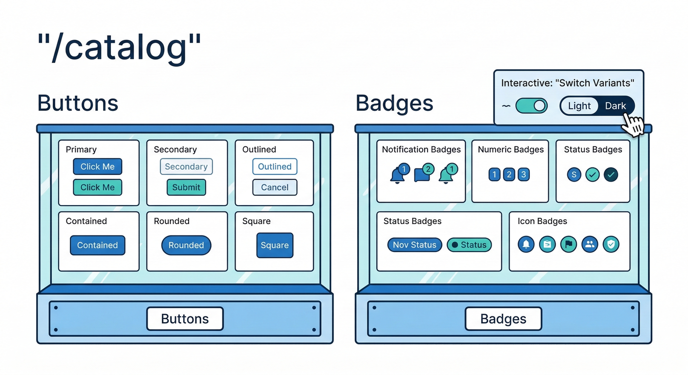
ルート構成イメージ🗺️
app/catalog/page.tsx
(テーマ切り替えやバリアント切り替えはクライアントでやるので、別ファイルに分けるよ🧸)
import { css } from "../../styled-system/css";
import { CatalogClient } from "./CatalogClient";

export default function CatalogPage() {
  return (
    <main
      className={css({
        minH: "100vh",
        bg: "bg",
        color: "fg",
        p: { base: "4", md: "8" },
      })}
    >
      <div className={css({ maxW: "960px", mx: "auto" })}>
        <h1 className={css({ fontSize: "3xl", fontWeight: "800" })}>
          Component Catalog 📖🐼
        </h1>
        <p className={css({ mt: "2", color: "{colors.gray.600}", _dark: { color: "{colors.gray.300}" } })}>
          ボタン・バッジ・カードを眺めて育てるページだよ✨
        </p>

        <div className={css({ mt: "6" })}>
          <CatalogClient />
        </div>
      </div>
    </main>
  );
}
app/catalog/CatalogClient.tsx
"use client";

import { useEffect, useMemo, useState } from "react";
import { css } from "../../styled-system/css";
import { Button } from "../../components/ui/Button";
import { Badge } from "../../components/ui/Badge";
import { Card } from "../../components/ui/Card";

export function CatalogClient() {
  const [mode, setMode] = useState<"light" | "dark">("light");
  const [tone, setTone] = useState<"solid" | "outline" | "ghost">("solid");
  const [size, setSize] = useState<"sm" | "md" | "lg">("md");

  // data-color-mode を html に反映(Multi-Themeの考え方そのまま) :contentReference[oaicite:16]{index=16}
  useEffect(() => {
    document.documentElement.setAttribute("data-color-mode", mode);
  }, [mode]);

  const code = useMemo(() => {
    return `<Button tone="${tone}" size="${size}">Hello</Button>`;
  }, [tone, size]);

  return (
    <div className={css({ display: "grid", gap: "6" })}>
      {/* Theme Switch */}
      <section className={css({ display: "flex", gap: "2", alignItems: "center", flexWrap: "wrap" })}>
        <Badge tone="outline">Theme</Badge>
        <Button tone={mode === "light" ? "solid" : "outline"} size="sm" onClick={() => setMode("light")}>
          🌞 Light
        </Button>
        <Button tone={mode === "dark" ? "solid" : "outline"} size="sm" onClick={() => setMode("dark")}>
          🌙 Dark
        </Button>
      </section>

      {/* Buttons */}
      <Card
        title="Buttons"
        desc="tone/size を切り替えて、見た目を確認しよう🎛️"
        footer={
          <>
            <Button tone="ghost" size="sm" onClick={() => setTone("ghost")}>👻 ghost</Button>
            <Button tone="outline" size="sm" onClick={() => setTone("outline")}>🫧 outline</Button>
            <Button tone="solid" size="sm" onClick={() => setTone("solid")}>🔥 solid</Button>
          </>
        }
      >
        <div className={css({ display: "flex", gap: "2", alignItems: "center", flexWrap: "wrap" })}>
          <Badge tone="neutral">size</Badge>
          <Button tone="outline" size="sm" onClick={() => setSize("sm")}>sm</Button>
          <Button tone="outline" size="sm" onClick={() => setSize("md")}>md</Button>
          <Button tone="outline" size="sm" onClick={() => setSize("lg")}>lg</Button>
        </div>

        <div className={css({ mt: "4", display: "flex", gap: "2", flexWrap: "wrap", alignItems: "center" })}>
          <Button tone={tone} size={size}>こんにちは🐼✨</Button>
          <Button tone={tone} size={size} disabled>disabled🥺</Button>
        </div>

        <pre
          className={css({
            mt: "4",
            p: "3",
            bg: "muted",
            borderWidth: "1px",
            borderColor: "border",
            borderRadius: "md",
            fontSize: "sm",
            overflowX: "auto",
          })}
        >
{code}
        </pre>
      </Card>

      {/* Badges */}
      <Card title="Badges" desc="ラベル系はバッジがあると一気にそれっぽい😳✨">
        <div className={css({ display: "flex", gap: "2", flexWrap: "wrap" })}>
          <Badge tone="brand">NEW✨</Badge>
          <Badge tone="neutral">Draft📝</Badge>
          <Badge tone="outline">Infoℹ️</Badge>
          <Badge tone="brand" size="sm">sm</Badge>
          <Badge tone="neutral" size="sm">sm</Badge>
        </div>
      </Card>

      {/* Cards */}
      <Card title="Cards" desc="Slot Recipe の威力:title/desc/body/footer をまとめて管理🍱✨">
        <div className={css({ display: "grid", gap: "3" })}>
          <Card
            title="Elevated"
            desc="影あり"
            footer={<Button tone="solid" size="sm">OK👌</Button>}
          >
            ここが本文だよ〜🌸
          </Card>

          <Card
            title="Flat"
            desc="影なし"
            variant="flat"
            footer={<Button tone="outline" size="sm">Details🔍</Button>}
          >
            こっちはフラット版!🧁
          </Card>
        </div>
      </Card>
    </div>
  );
}
7) codegen を回して起動しよう🚀
- まだなら:
npx panda codegen(設定/Recipeを変えたら基本これ) - Next開発:
npm run dev
8) ありがちハマり(助けるよ🥹)
❌ 「スタイルが当たらない!」
Next.js が PostCSS 生成物をキャッシュして、.next を消す必要があることがあるよ〜! (panda-css.com)
Windows(PowerShell)例:
Remove-Item -Recurse -Force .next
npm run dev
(Panda公式だと dev スクリプトで .next を消してから起動する例が載ってるよ🧹 (panda-css.com))
9) ミニ課題(提出物)🎓✨
✅ 必須(ここまでやれば第274章クリア!)
/catalogを作る- Button/Badge/Card が並ぶ
- ライト/ダークで色が変わる(Tokenで)
🌟 追加チャレンジ(余裕があれば!)
Buttonにloading見た目を追加(くるくる🌀)Cardにtone(brand/neutral)を追加して、背景色を変える🎨/catalogの各セクションに “使いどころ” コメントを書く💬✨
必要なら、今のプロジェクトのフォルダ構成(src/ あり/なし)に合わせて、importパスを「あなたの形」にピッタリ揃えた版も作るよ〜🐼🧡